Banks evaluating compliance software need vendors that sound established and purpose-built. Under After renamed the San Francisco regtech company Beam and built a brand identity around the dual meaning of structural foundation and focused light.

Beam Regtech Brand Identity and Naming
Banks evaluating compliance software need vendors that convey established credibility and purpose-built expertise. CCO Box, a San Francisco regtech company serving financial institutions, faced positioning challenges with its original name. The reference to Chief Compliance Officer made it sound like software built by compliance officers rather than for them, and the name limited narrative expansion beyond banking compliance.
Under After renamed the company Beam, connecting the name to the product's core function: focused transaction monitoring that cuts through noise to identify suspicious activity. The name carries dual meaning as structural foundation (steel beam, reliability) and focused light (precision, speed, clarity). The brand identity built on this contrast between solid and light, using clean typography and structured layouts to convey reliability and technical precision.
“Under After, led by Mark Forscher, came to us from a very good recommendation and still managed to exceed our high expectations. For our renaming project, Mark expertly guided us through the process of selecting from a variety of creative naming options he created and selected based on our own goals and expectations for the brand. For our visual identity, Mark produced a fantastic look that met every single one of our goals. Throughout both processes he was professional, prompt, and a pleasure to work with. We will unquestionably work with Mark on future projects and I could not more strongly recommend him and Under After.”
Regtech Product Naming Strategy
In regtech, naming affects buyer confidence. Banks need vendors that sound established and purpose-built, not makeshift or departmental. The CCO Box name anchored the company to a single role and industry, making product expansion narratively difficult.
The studio developed Beam as a name that positions the platform as focused technology rather than compliance toolkit. The dual meaning connects to product functionality while conveying reliability and precision—critical attributes for transaction monitoring software serving financial institutions.
Visual Identity System
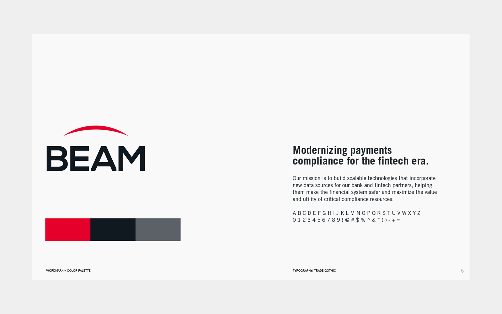
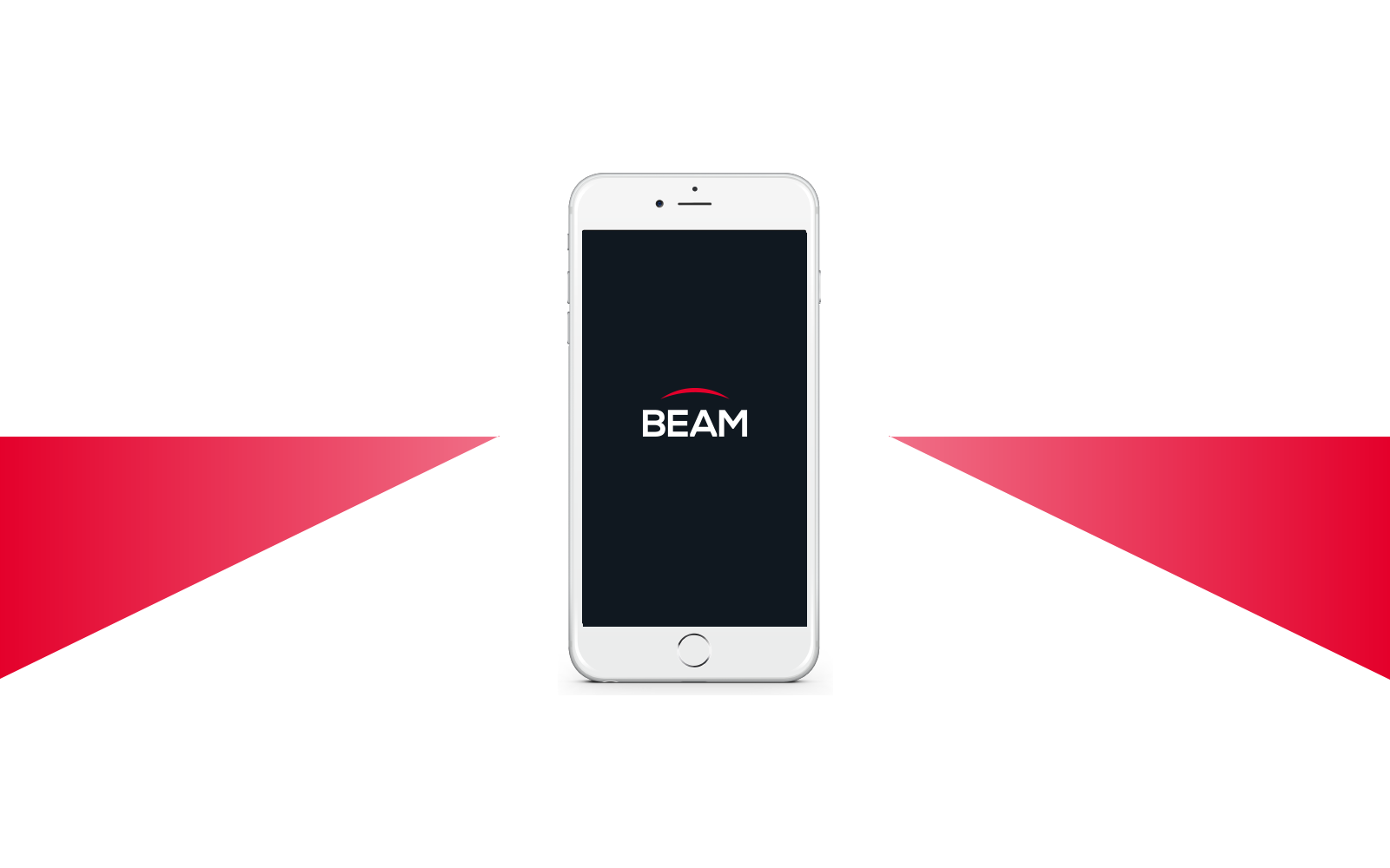
Under After created a visual identity that builds on the contrast between solid and light. The brand system uses clean typography and structured layouts to convey reliability and technical precision, while the mark's geometry suggests both architectural foundation and directional focus.


Client team: Ben Duranske (Co-Founder), Andreas Bayer (Co-Founder)


